Bento Grid
A customizable shadcn-style grid system for creating modern, responsive masonry layouts.
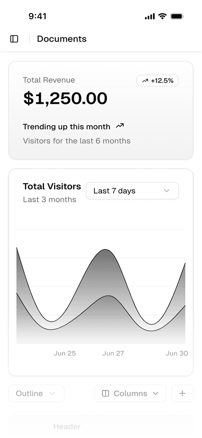
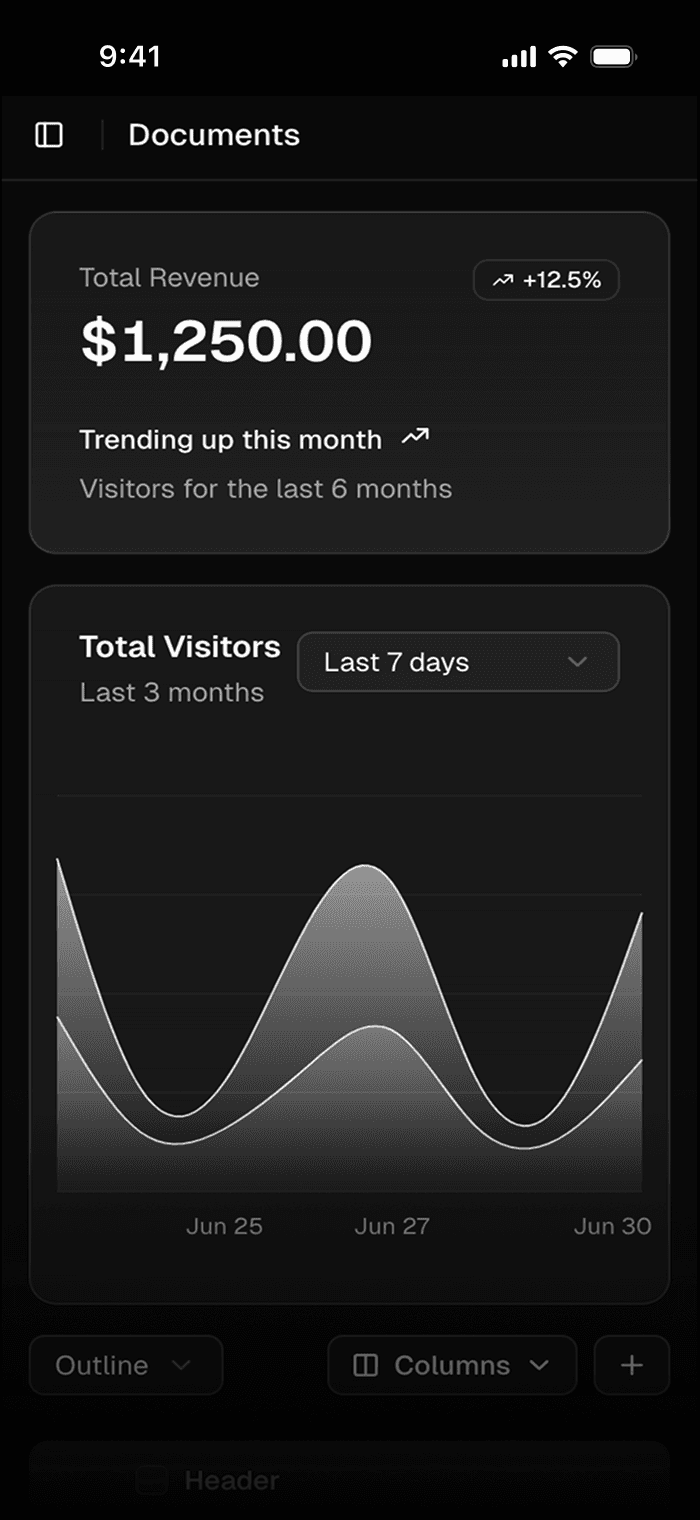
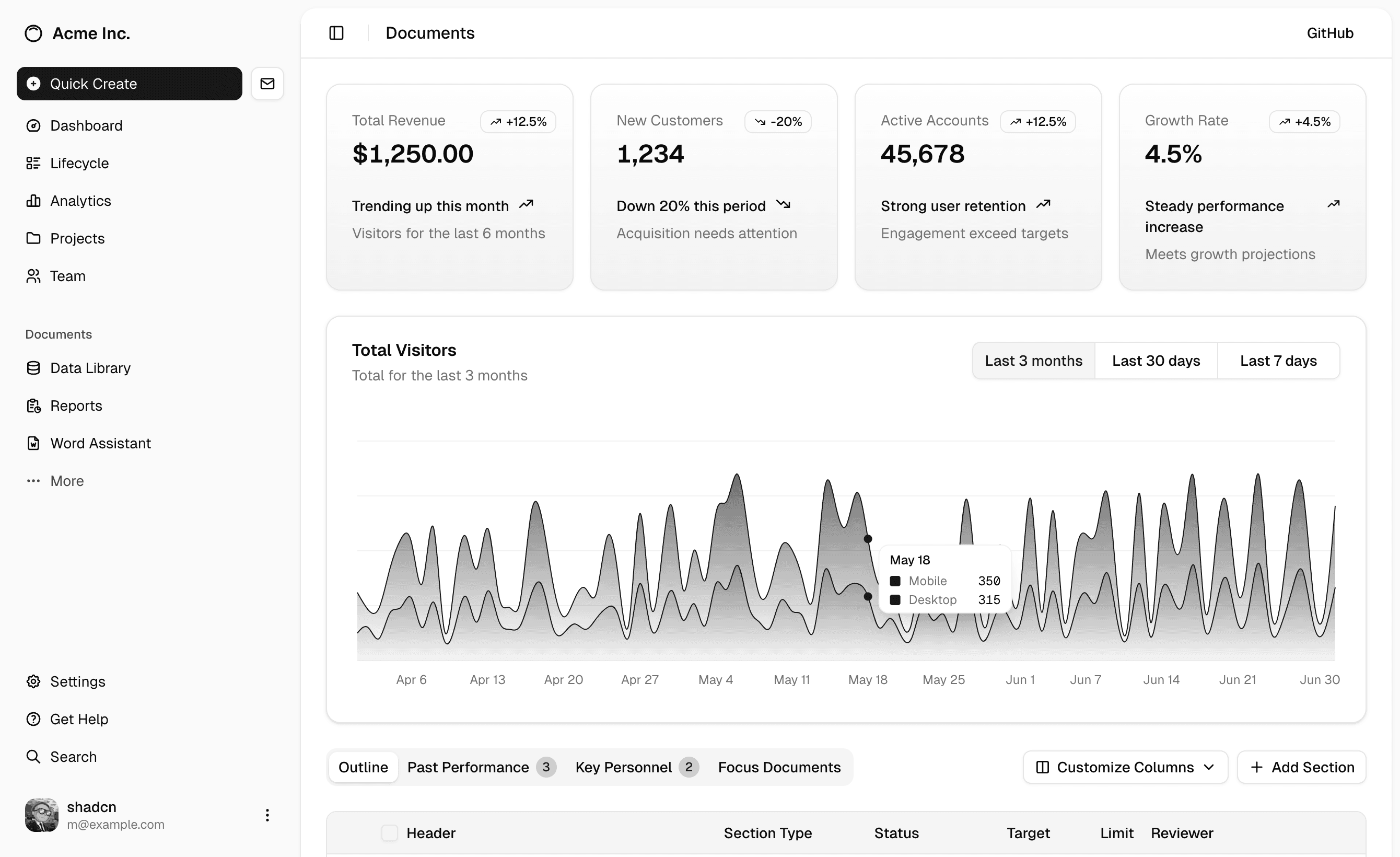
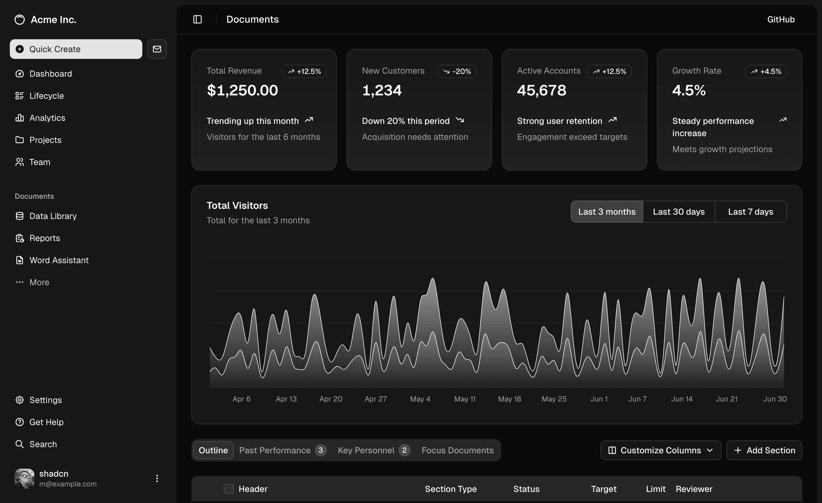
The Bento Grid component offers a flexible approach to creating visually appealing content arrangements in the style of popular shadcn components. Built with Tailwind CSS and React, it provides a robust foundation for modern web layouts.
Perfect for showcasing features, products, or content, this component implements a card-based layout system that maintains both aesthetics and functionality. The grid system adapts seamlessly to different screen sizes while preserving the elegant visual hierarchy of your content.
Installation
Set up project
If you haven't done that already, follow the installation guide before installing your first component.
Purchase Launch UI Pro
Get access to Launch UI Pro and copy the files you need into your projects.
Get Launch UI ProInstall dependencies
npx shadcn@latest add @launchui/bento-grid
Usage
It's all about design quality
In a world where everybody can vibe-code a new thing overnight, the key is to stand out. Generic-looking shadcn/ui blocks won't help you to get noticed. With Launch UI, you can make sure that your design is unique and memorable.
Design-first
Each block and component is carfully crafted—not generated by AI—to give a unique look and feel AI would never come up with.


Made for fast development
With lightweight code, modern tooling and best practice, Launch UI is as fast in the browser as it is to build with.
The code is yours
With Launch UI, the code is yours forever. Never bother about subscriptions and lock-ins.
page.tsx
globals.css
import { cn } from "@/lib/utils";
import clsx from  "clsx";
import { PropsWithChildren } from "react";

type NoteProps = PropsWithChildren & {
 title?: string;
 type?: "note" | "danger" | "warning" | "success";
 className?: string;
 };

export default function Note({
 children,
 title = "Note",
 type = "note",
 className,
 }: NoteProps ) {
 const noteClassNames = clsx({
 "dark:bg-stone-950/25 bg-stone-50": type == "note",
 "dark:bg-red-950 bg-red-100 border-red-200 dark:border-red-900":
 type === "danger",
 "dark:bg-orange-950 bg-orange-100 border-orange-200 dark:border-orange-900":
 type === "warning",
 "dark:bg-green-950 bg-green-100 border-green-200 dark:border-green-900":
 type === "success",
  });
@import "tailwindcss";

@plugin "tailwindcss-animate";

@import "../styles/syntax.css" layer(utilities);
@import "../styles/theme.css" layer(utilities);

@custom-variant dark (&:where(.dark, .dark *));

@theme inline {
 --color-brand: var(--brand);
 --color-brand-foreground: var(--brand-foreground);
 --color-light: var(--light);
 --color-light-foreground: var(--light-foreground);
 --color-background: var(--background);
 --color-foreground: var(--foreground);
 --color-sidebar-ring: var(--sidebar-ring);
Top-level performance
Build a website that is hard to forget.
Build a top-notch landing page even if you don't have the time for it. Create an irresistible offer that speaks professionalism and hi-end design.
The code is yours
With Launch UI, the code is yours forever. You can use it as a starting point for your own projects and customize it to your needs.
Never bother about subscriptions and lock-ins.
Data-agnostic
All the data is separate from components so you can edit it in seconds or make it dynamic.
Easily connect to a CMS of your choice.
Integrate website and product
Integrate your landing page directly in the product and forget about multiple codebases and unnecessary APIs.
No extra dependencies, no extra maintenance.


Top-level performance
Made for search engines
Unlike the bloated no-code solutions, Launch UI is built to be perfectly optimized for search engines.
Build a website that is hard to forget.
Build a top-notch landing page even if you don't have the time for it. Create an irresistible offer that speaks professionalism and hi-end design.
Made for search engines
Unlike the bloated no-code solutions, Launch UI is built to be perfectly optimized for search engines.
The code is yours
With Launch UI, the code is yours forever. You can use it as a starting point for your own projects and customize it to your needs.
Never bother about subscriptions and lock-ins.
Build a website that is hard to forget.
Build a top-notch landing page even if you don't have the time for it. Create an irresistible offer that speaks professionalism and hi-end design.
Data-agnostic
All the data is separate from components so you can edit it in seconds or make it dynamic.
Easily connect to a CMS of your choice.
Top-level performance
With no heavy assets or dependencies, your website will feel snappy and load instantly.
No bloat, no extra maintenance.
Need more variants?
Learn how to create more variants on your own.
Check out my free course designwithcode.dev
Need help?
File a feature request, report a bug, or ask me anything.